

The human brain is a very funny organ. Weighing in at a solid three pounds, it’s basically a compact laptop with a million USB ports and unlimited connectivity sitting within our skulls. We’re probably all very lucky, then, that it only ever operates at 10% power. Imagine the fuse that mass of wires would blow if they all started working at the same time!
Actually, don’t imagine that. It would be horrible. And the plot of the movie “Lucy.”
The input our brains receive is straight from our senses and in advertising and marketing, the primary sense we relate to is sight. If we can see it, we can understand it. If we can understand it, we can identify with it. And if we can identify with it, we can purchase, use, and endorse it.
Congratulations! You’ve now completed Advertising 101; your certificate is in the mail.
Jessica Ridgway, a doctoral candidate at the University of Missouri-Columbia, put together a study on how specific colors used in a company’s logo significantly impact not just the logo’s perception, but the brand’s overall perception as well. The 2014 study found that “the specific colors used in a company’s logo have a significant impact on how that logo, and the brand as a whole, is viewed by consumers.”
The results of Ridgway’s study revealed the following about logo colors and their associations:
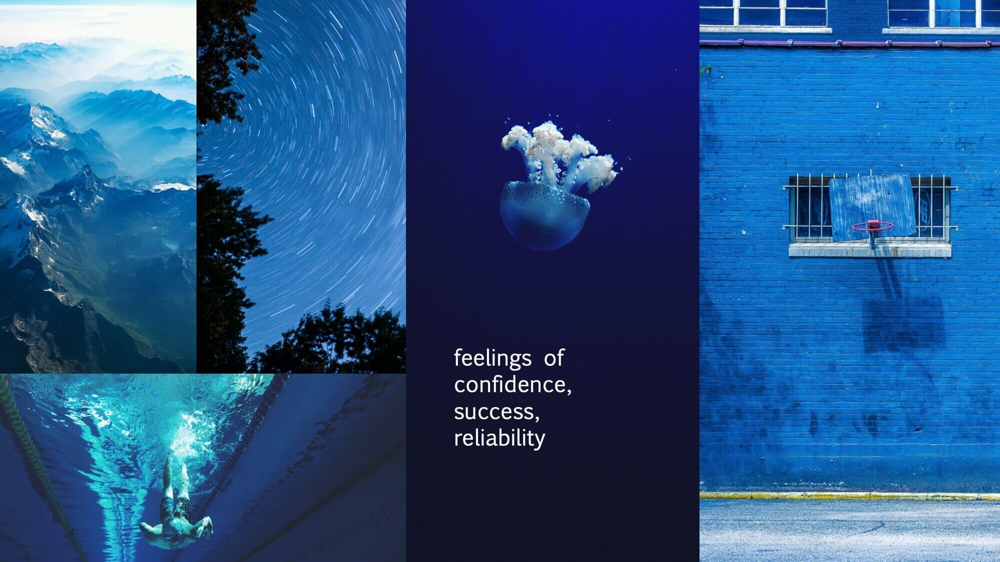
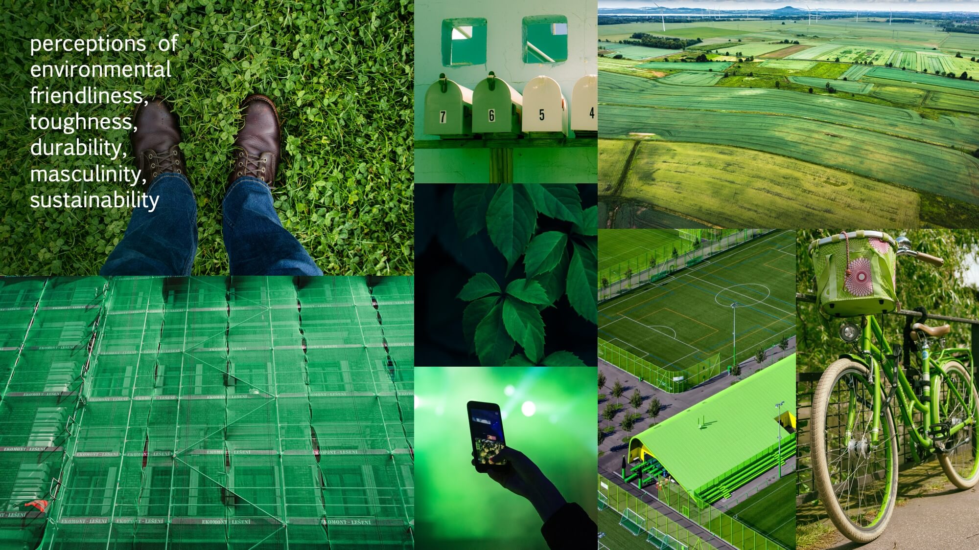
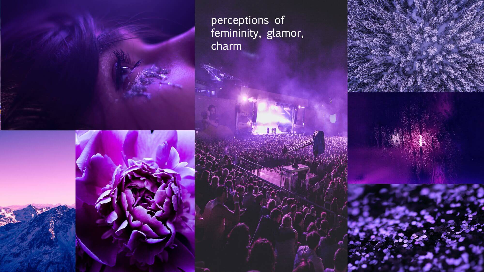
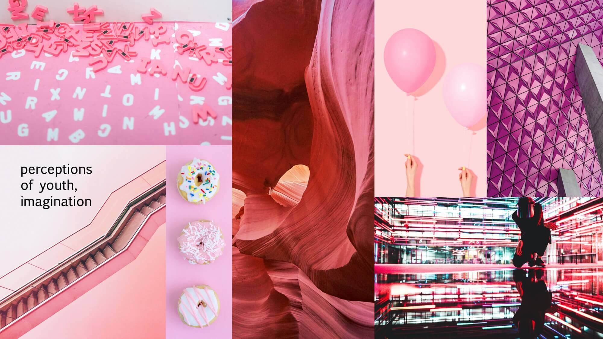
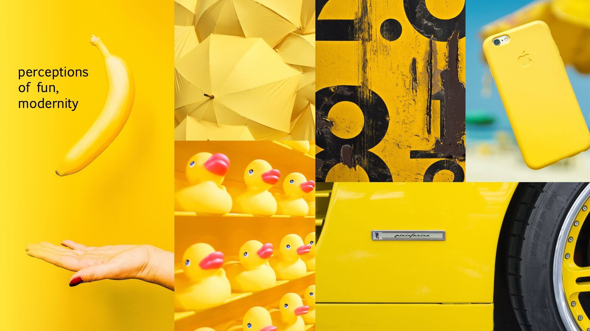
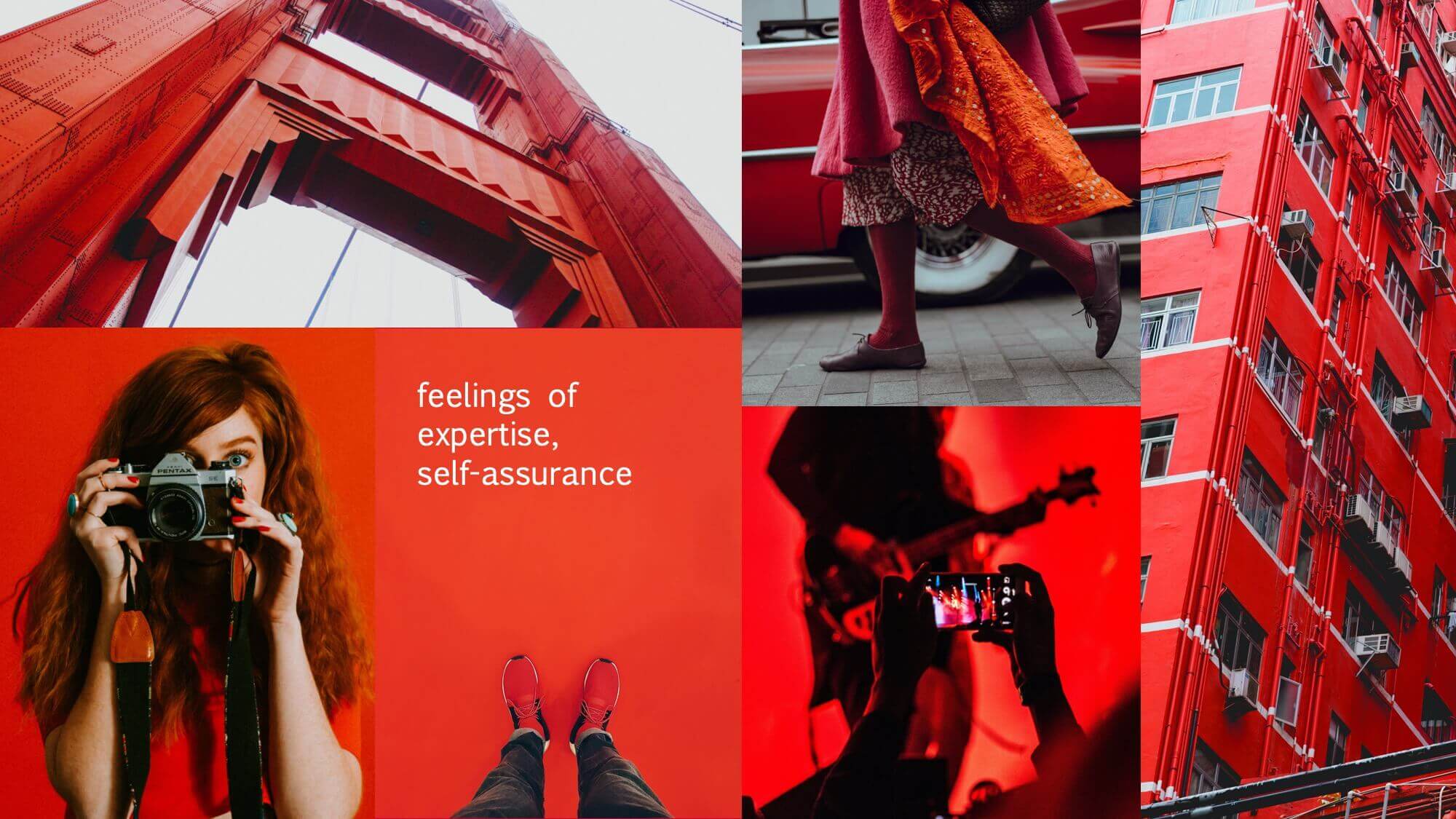
While most of the color associations were expected, Ridgway did hit a surprising finding with the red logos she examined. “Traditional emotions based on red include aggression and romance,” she says, “but red logos did not invoke those emotions in study participants.” Ridgway believes that instead, participants may have associated red with expertise and self-assurance because of the brands most commonly linked to red logos: McDonalds, State Farm, and ESPN. “Consumers have pre-existing emotions associated with brands using that color,” she says.
So, if you’re currently working on a logo design, should you drop everything you’re doing and spend lots of time and money on color research? Probably not, but you should – absolutely – spend time thinking both critically and strategically about the emotions you want your brand to evoke in its consumers.
For example, looking for a sense of reliability? Go with shades of blue for the logo. Or do you want to appear fun and modern? Yellow’s your best bet, then. Ridgway’s study wants brand managers to remember that traditional color associations alone are not the pathway to success. Instead, “they must stay attuned to how colors are viewed and applied in popular culture, such as in entertainment, as this tends to influence consumers’ color associations.”
Some important points to remember the next time you’re thinking of making your dinosaur logo a vibrant shade of purple. Barney did it first and left a lasting impression.
Feature photo by Robert Katzki on Unsplash
