

Just a few years later, it fell from grace. The public that loved it so much turned its back on Comic Sans, relegating it to the same pile as Papyrus and Courier New: unused, unloved, and, yet, unforgettable.
Now celebrating its 25th birthday, Comic Sans enjoys a cult following. There are those who appreciate its simplistic style, novices who do their own design work and others in the public who enjoy a certain level of “fun” associated with its rounded lines.
CS, as he’s known in certain circles, has remained oddly quiet on the subject of his own D-list status. Until now. Recently, we sat down with Comic Sans for a rare and intimate interview.
Tell me a little bit about yourself, where you came from and how you got your start.
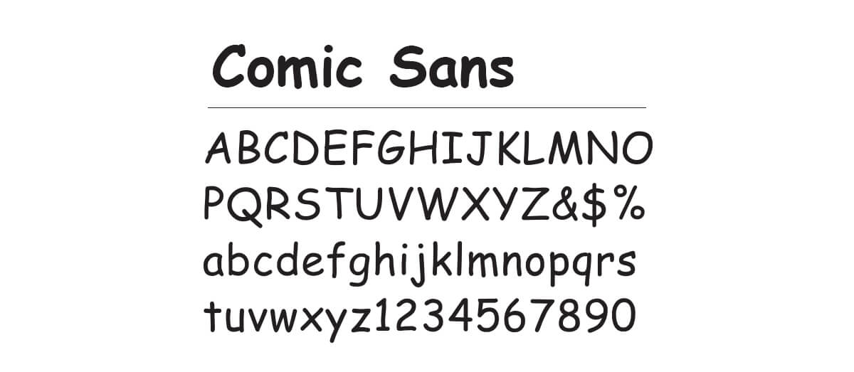
Well, believe it or not, I was the product of Vincent Connare’s love of comic books. He had issues of Watchmen and Batman comics laying around his office at Microsoft and he loved the roundness to the lettering.
Did you ever think you’d become so popular?
Honestly, I didn’t. Vinnie didn’t, either! He created me on a whim while testing out fonts for a software package. Microsoft loved it and included it in the Windows ’95 build – I became so popular they made me a default font! Can you imagine? Happy accidents, right?

Vincent Connare, regarding your appearance on the scene, commented: “Comic Sans isn’t complicated, it isn’t sophisticated, it isn’t the same old text typeface like in a newspaper. It’s just fun – and that’s why people like it.”
Oh, you mean the designers in Indianapolis, the ones who founded the ‘Ban Comic Sans’ movement in the late nineties?
Yes.
I’m not exactly happy about it – who would be, honestly? Plus, those guys were designers and I’ve always had a love/hate relationship with designers.
Why do you say that?
Designers love typography, which makes any red-blooded font happy, but they love professional and mature typography. They want to use fonts that create professional and mature products. I’m a kid in their eyes.
Do you feel like your youth works against you in typography, that if you were a more mature font, you’d be used more in the graphic design world?
My age is definitely an issue. I’m a fair amount younger than most of the others that came along with the Windows ’95 build. I mean, look at Times New Roman. That guy’s got decades on me and he doesn’t look a day over three.
I’ve been around 25 years, though, so there must be something appealing about my childlike manner.
Do you feel like you miss out on more high-profile work because of that childlike quality?
Not really. I’m a headliner most of the time, which means I’m the first thing people see. And the kids love me. They should, right? I look like a six-year-old hand-drew me with a crayon!
You’ve got a lot of defenders out there, too. Have you seen any of the YouTube project #22songs? They dedicated a whole song to you, calling you “the best font in the world”.
I did see that! I loved the message – use me in moderation. It made me feel so grown up, like that font on the Tanqueray bottle.
Well, CS, it’s been a pleasure speaking with you. We wish you the best of luck in the future.
Thanks for having me. Just out of curiosity, where do you stand on the whole debate? Are you a fan or a fan of banning?
Well…
Ouch.
Reference: Not My Type: Why the Web Hates Comic Sans


