

Branding isn’t just about graphics and colors, though. It’s also about the text associated with the brand.
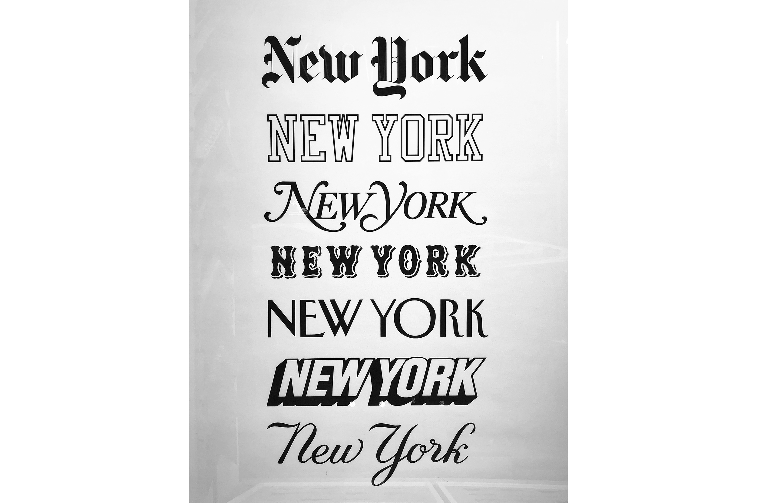
Are we representing with the right kind of font?
Cognitive fluency is, quite simply, a measure of how easy it is for you to think about something. EASY = TRUE.
Applied to branding, cognitive fluency suggests that the text should be simple and to the point, the font should be easy to read. Fonts like Arial and Helvetica, sans serif fonts that don’t crowd each other, minimize the effort needed to read them and therefore increase the rate of success in getting their message across.
What am I trying to say?
Words add impact and (literally) make a statement—that’s why they’re so important for branding. A graphic isn’t always worth a thousand words, and in those instances when text is necessary to convey a message, it’s important to make sure the fonts you use are communicating that message effectively.
There are five considerations for font choice:
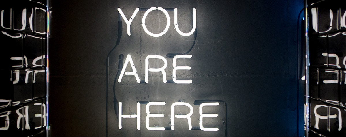
Set a tone
The text is telling your audience that you’re selling trucks, but the font suggests you’re selling cupcakes. What’s the right tone if you’re trying to get people to buy a Dodge Ram instead of a chocolate frosted cupcake?

Informal vs. formal
If you’re selling a Rolls Royce, then your audience is a little more formal than the one that’s buying a Jetta. Which font style, formal or informal, works best for the tone you’re setting?
Masculine vs. feminine
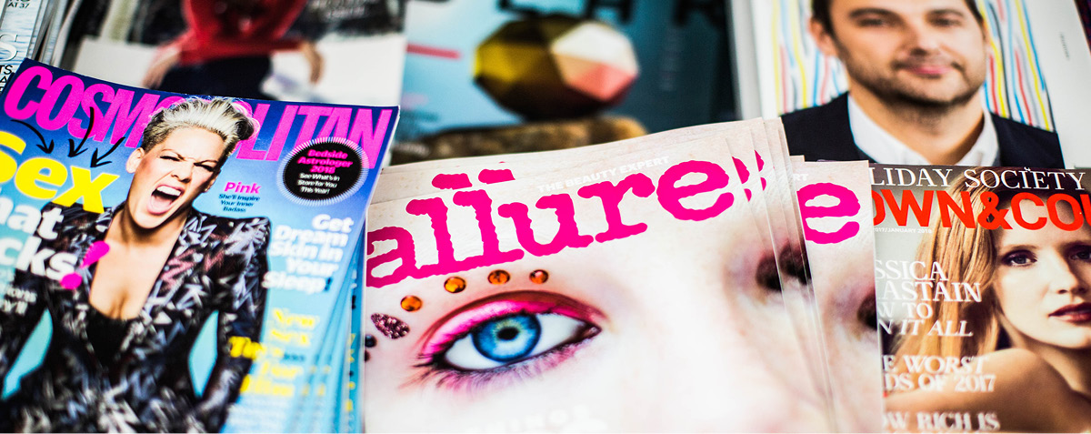
This isn’t about gender stereotypes—plenty of women find cigars sexy and plenty of men are willing to buy a pink razor to support breast cancer awareness. What it is about, however, is pairing the right font with the right kind of tone. Know your audience: are you using a loopy, loose font to sell a Porsche or how about a straight-lined, Helvetica-esque font to sell perfume?
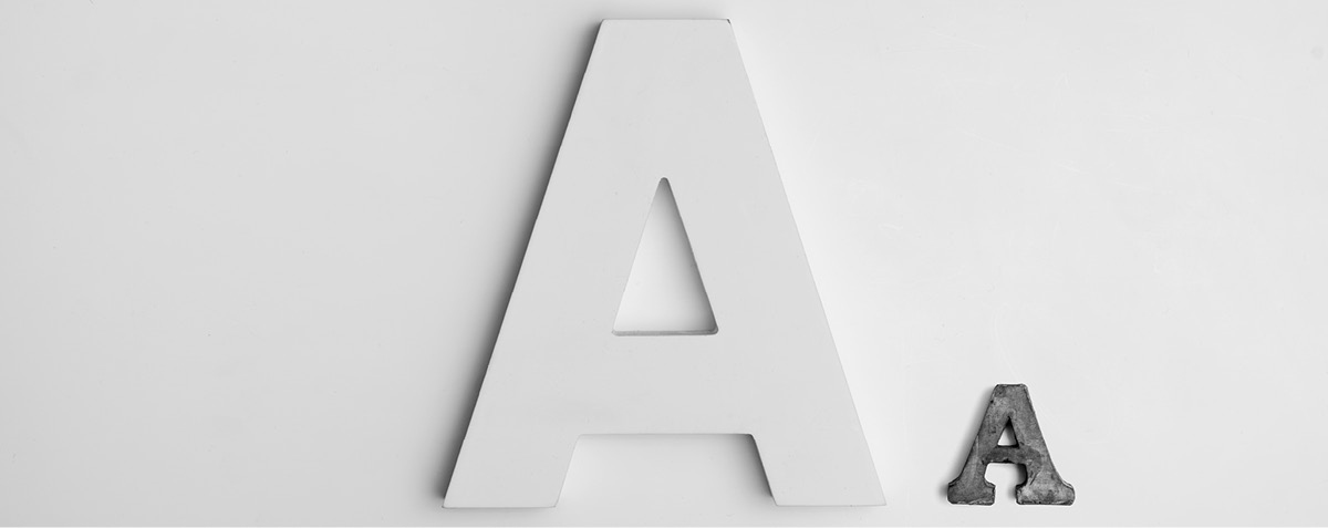
Big vs. small
Font size makes a difference. If it’s easy to read and draws the reader’s attention, then it’s doing right by its purpose. Depending on the venue, are you going BIG and grabbing the audience or are you using small print to be approachable?
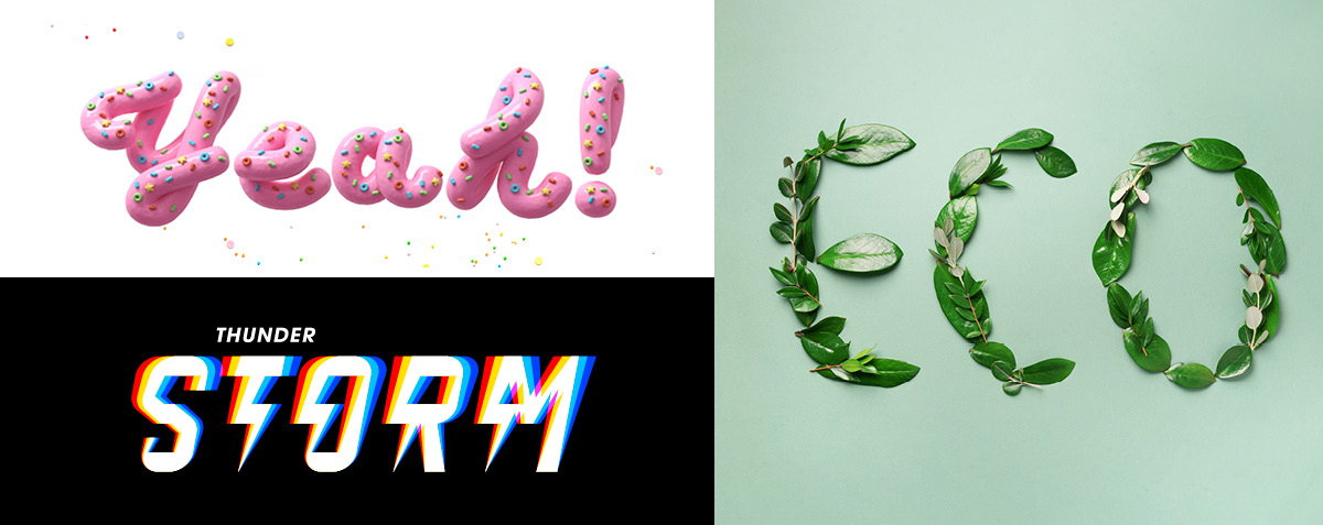
Use type as art
Typography can be treated as works of art—literally. Letters can be made from just about anything, or they can take on an illustrative form to help accentuate the meaning behind the message. Considering what you’re branding, would a more artistic treatment of the type work, or would something more simple be appropriate?
It may seem like a daunting task, to infuse your text and typeface with the right amount of psychology, but it’s relatively simple. Use clear and precise fonts; make the text easy to read; don’t allow the message to get lost in the typeface; and remember to think not only as a graphic designer or copywriter but also like your audience.
Most of all, don’t panic!
(Oh, and never, ever, ever use comic sans.)
Feature Photo by Meric Dagli on Unsplash
